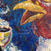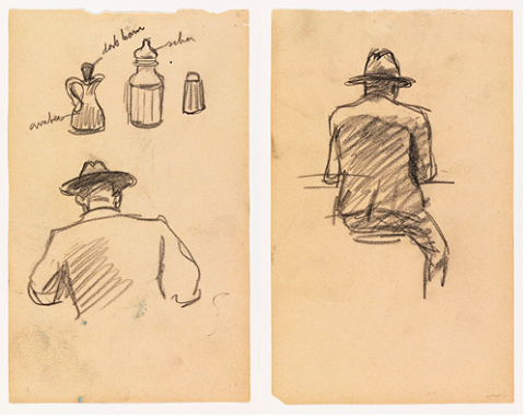
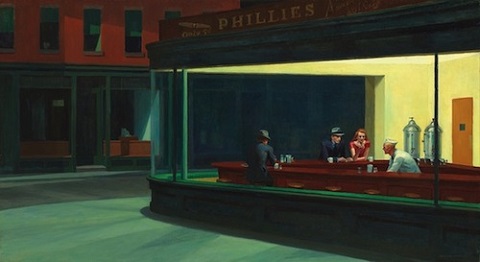
Edward Hopper’s Nighthawks (1942) doesn’t just evoke a certain stripe of mid-century, after-hours, big-city American loneliness; it has more or less come to stand for the feeling itself. But as with most images that passed so fully into the realm of iconhood, we all too easily forget that the painting didn’t simply emerge complete, ready to embed itself in the zeitgeist. Robin Cembalest at ARTnews has a post on how Edward Hopper “storyboarded” Nighthawks, finding and sketching out models for those three melancholic customers (one of whom you can see in an early rendering above), that wholesome young attendant in white, and the all-night diner (which you can see come together in chalk on paper below) in which they find refuge.
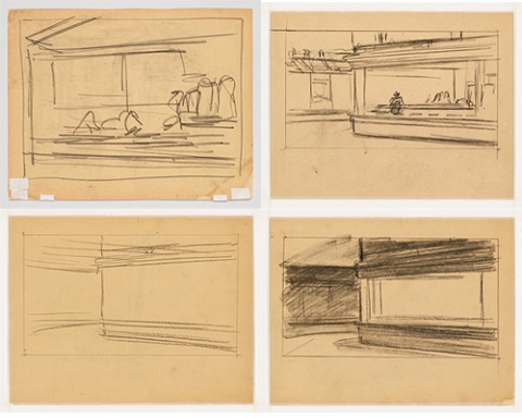
These “19 studies for Nighthawks,” writes Cembalest, “reveal how Hopper choreographed his voyeuristic scene of the nighttime convergence of the man, a couple, and a server in the eerie Deco diner, refining every nuance of the countertop, the figures, the architecture, and the effects of the fluorescent lighting.” In each sketch, more pieces have fallen into place: a diner assumes their position, the light finds its angle, the perspective shifts to that of an outsider on the darkened street. Cembalest quotes Whitney curator Carter Foster describing the final product as a “marvelous demonstration of both extreme specificity and near abstract compositional summation on the same surface beguilingly [which] reflects how empirical observation and imagination coexisted in Hopper’s head.”
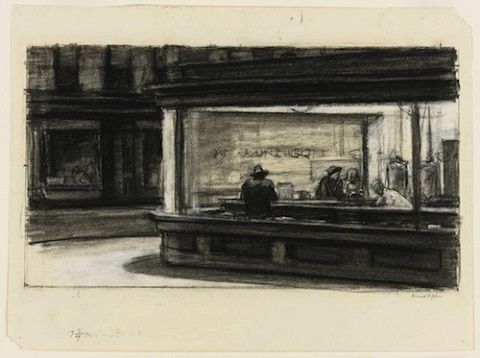
Despite how many elements of the real world Hopper studied to create Nighthawks, it ultimately depicts no real place. The painter himself posed for the male figures, and his wife modeled for the female. As for the locale, seen in the final drawing just above, Cembalest notes that “after years of research and scholarship, experts have determined that Nighthawks was not inspired by one specific diner. Rather, it was a composite of wedge-shaped intersections around Greenwich Avenue. Its curving prow seems partly inspired by the Flatiron Building.” In a way, it almost seemed too realistically New York to actually exist in New York. Hopper painted a distillation of a sense of American place, and like many American places, I’ve never quite known whether I’d love to drop in at the Nighthawks diner (though I’d have to find a front door first), or whether I should count myself lucky that life hasn’t relegated me to it. You can learn more about the fascinating storyboarding of Nighthawks at Art News and see many more sketches. Speaking of the sketches, they come courtesy of The Whitney Museum of American Art.
via ARTNews
Colin Marshall hosts and produces Notebook on Cities and Culture and writes essays on cities, language, Asia, and men’s style. He’s at work on a book about Los Angeles, A Los Angeles Primer. Follow him on Twitter at @colinmarshall or on Facebook.


